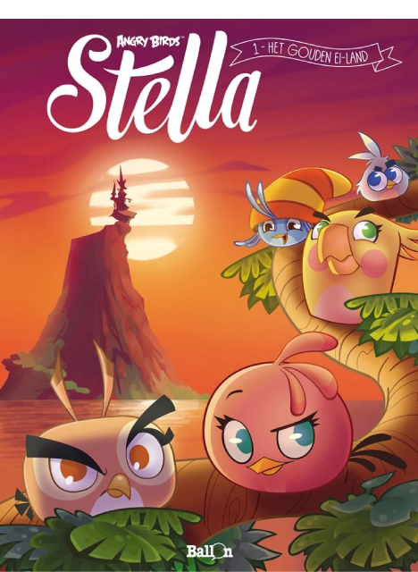
Stella, la téméraire et dynamique oiselle des Angry Birds, a rejoint ses meilleures amies Willow, Dahlia, Poppy sur Golden Island, pour de nouvelles aventures. Seule ombre au tableau, son ex-meilleure amie, Gale, se prend pour une princesse de légende depuis qu'elle a trouvé le grimoire supposé la mener au légendaire Œuf d'Or. Aventures, rires et conflits en perspective pour ces meilleures amies du monde... la plupart du temps !
Read here
The first volume of an Angry Birds Stella comic series that never made it outside Europe. Therefore, it is only available in French, Czech, Dutch, Spanish, and German.
The version that was uploaded to the Fandom Wiki page in the link above is the Dutch version. Unfortunately, I don't have much experience with Dutch, and I don't trust Google Translate enough, so the only feedback I can offer story-wise are stuff that can be easily inferred by anyone with sight. Even then, those inferences would lack a decent chunk of context.
What I CAN offer my opinion of is the artwork. Instead of sticking to a singular style, these comics instead experiment with a variety of different artstyles from different artists. Four, to be exact.
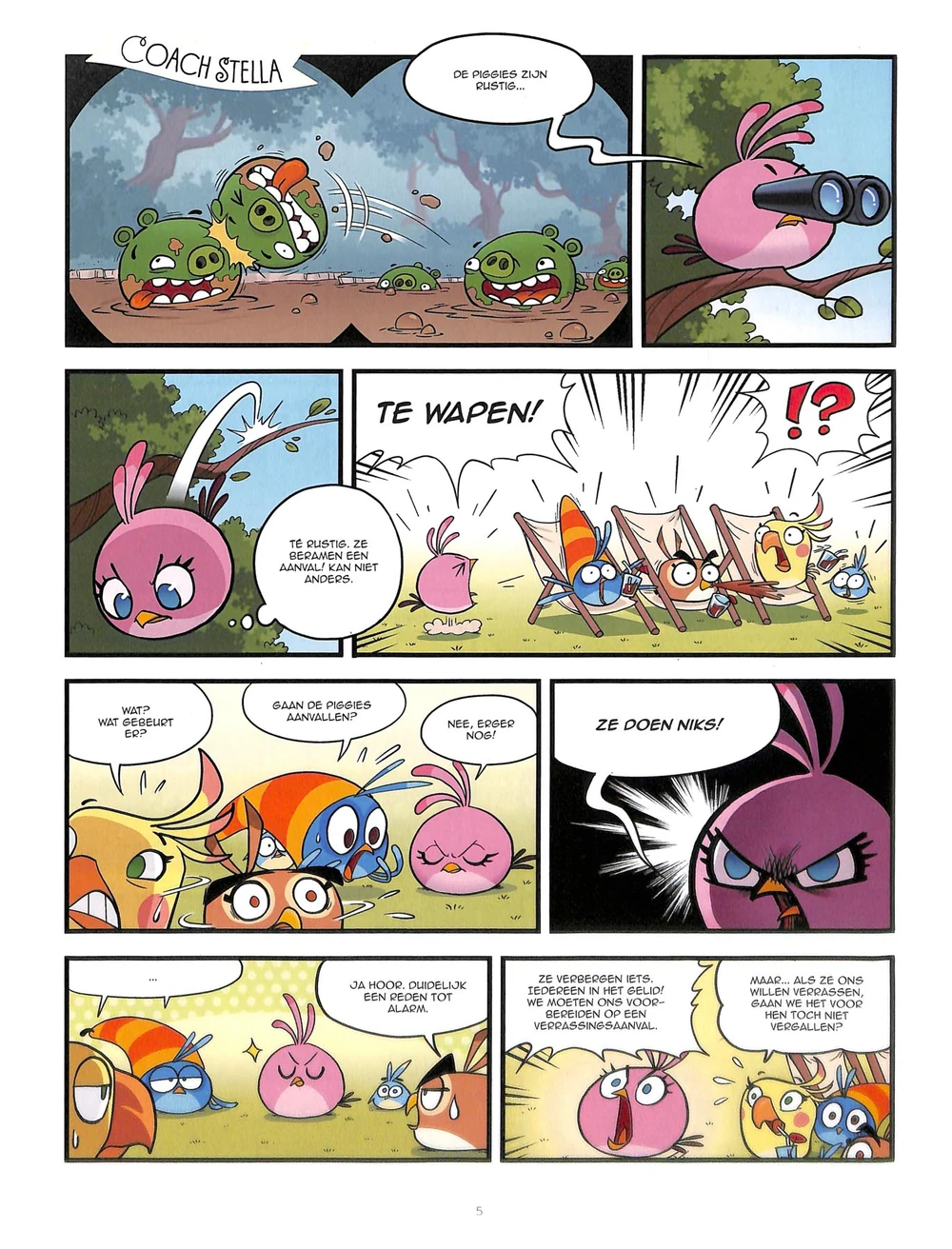
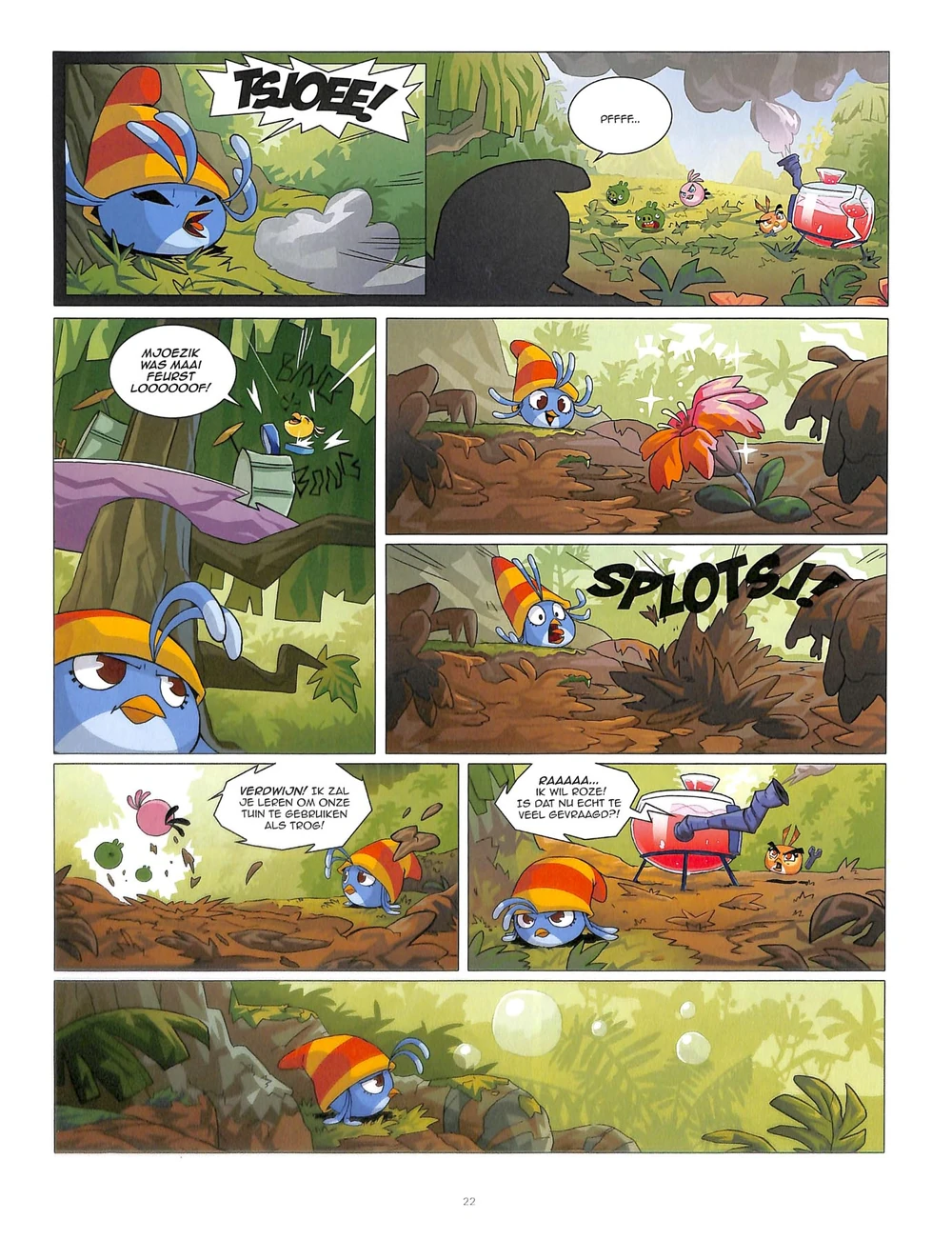
My favourite one has to be the one featured in "Coach Stella"; it's simple, yet incredibly expressive!
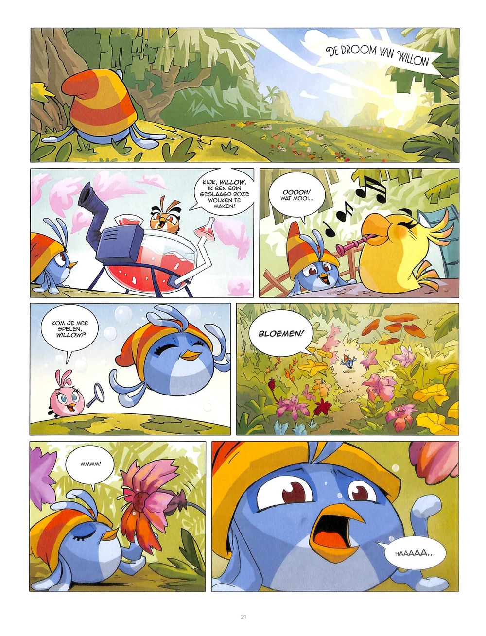
Sure, there's another artstyle shown in "De Babysit" and "De Droom Van Willow" that's "objectively" prettier...
...but I prefer the more exaggerated emotions of the first artstyle. Plus, I'm more inclined to give the "Coach Stella" style extra points for having its own identity instead of mimicking the official artstyle.
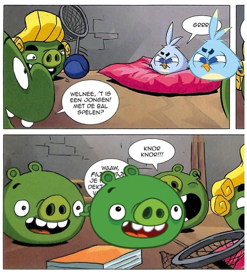
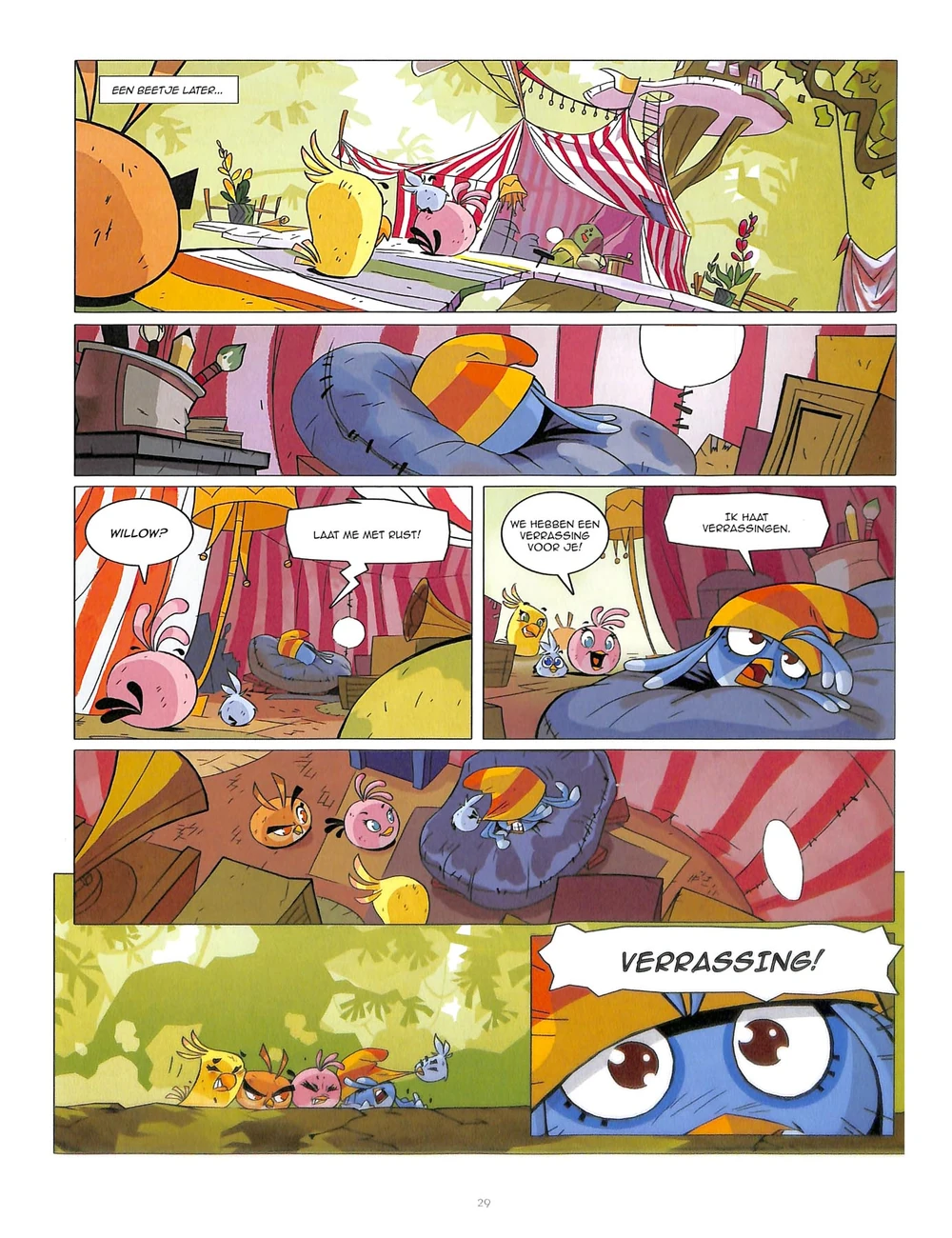
Actually, speaking of the mimicking official stuff, this second artstyle had a bit of a rough first impression during "De Babysit", with some art clearly being traced and all...
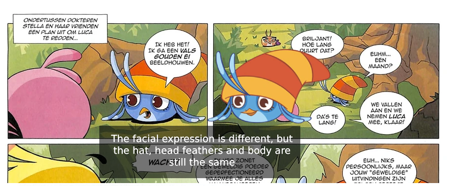
...but then it jumps in quality by "De Droom Van Willow", or at least it didn't trace any sprites that I know to heart. Either way, it did save itself enough to earn second place.
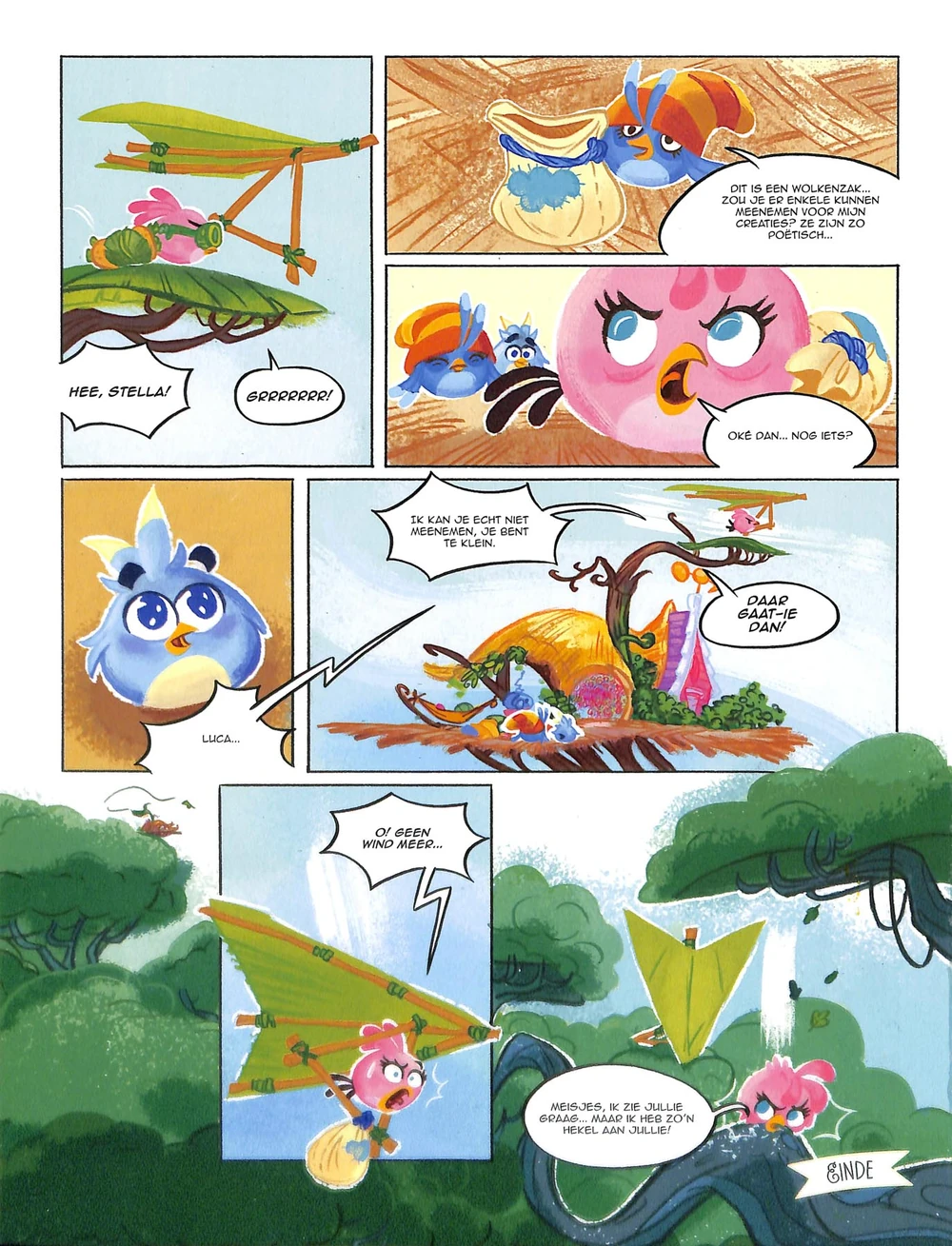
However, it still has to share that second place with the lineless style seen in "Spiegelbeeld", "Castle...Vania!", "Ze Houdt Van Me... Of Niet?", and "Leve De Wind". To be honest, I still liked what I saw in "De Droom Van Willow" more than I did with these lineless stuff, but it gets points for, again, having its own identity, and most importantly, not resorting to tracing.
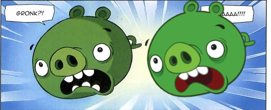
Finally, at personal last place is the "In Love With Shakespeare" artstyle (the title is in English for whatever reason). There's nothing blatantly wrong with it in a vacuum, but if you compare it to the 3 other styles, you'd find that it is undoubtably the weakest in terms of expression. Each bird only has like 2-3 faces in the whole thing.
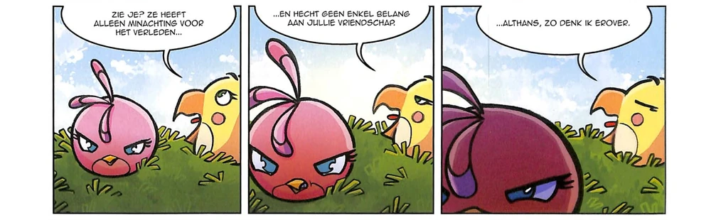
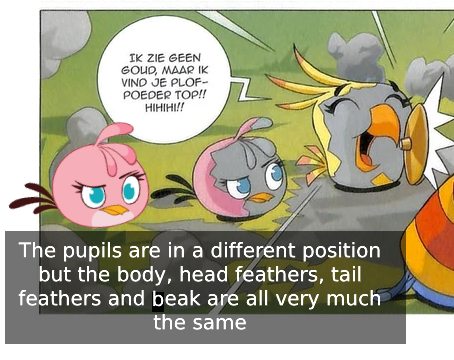
Stella's supposed to be increasing in rage here, but her expression is basically the same in all 3 panels.
It may feel weird how much I emphasize expressiveness, but when your characters are nothing but heads with faces, you better be damn good at drawing expressions!
Anyways, that's about it. Here's Marie Curie. See ya.

^ Click to go back